In order to design effectively you have to understand the fundamentals of design. That way, when you break a few rules you can break them the right way.
There are a lot of things to keep in mind while designing, from typography, to layout, to color. This list will help guide you when designing.
- Letter Spacing
Letter spacing doesn’t sound like that big of a deal, but it can make the world of difference when it comes to legibility.
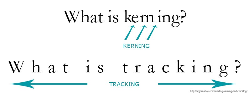
Kerning is the adjustment of space between characters. The ultimate goal of kerning is to make sure that the space between each letter is visually even to make for a neater and orderly text while making your text easier to read.
Tracking is similar to kerning in that it adjusts the space between characters, but where kerning is the space between an individual letter, tracking is the space between a group of letters. For example, by making the tracking larger in a paragraph, the space between all of the characters will increase.
Leading is the space between two baselines of type. If the leading is too small the type will appear squished in the space.
- Keep Your Line Lengths Short
If you’ve ever struggled through an article online or in a magazine because you kept losing your place this is the fault of badly structured line lengths. The golden rule is about 30-40 characters on each line. When lines are too short they appear choppy and if they are too long they become tedious and difficult for the eye to follow.
- Appropriate Typeface
When choosing a typeface there are several things you should consider. Readability is the most important thing when it comes to choosing a typeface. You want to make sure that the typeface is easy to read so that your message gets across to the audience. Never use a display font for body copy and never stretch a typeface to make it fill a space. Your design will always benefit if you take the time to find the appropriate typeface. You also have to consider your audience when you are choosing a typeface. You wouldn’t use the same typeface on the package of a children’s toy that you would on a business card for a law firm.
- Use The Correct Type Alignment
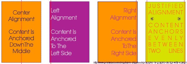
Left aligned type is the most common form because it is the most legible since we read from left to right. When in doubt, left align.
Right alignment is most likely used for decorative purposes or small sections of type in publications. It isn’t recommended to right align a large group of text. With the left edge left ragged, it makes it hard for the eye to follow and difficult to find the next line.
Centered text can be used for a wide variety of reasons. Centering text makes it easy to balance out a design but similar to right aligned text it is not recommended for large bodies of text.
Justified text is when the body of text has a neat left and right edge. In some cases justified text can be great, but it also has a lot of issues, mainly spacing. It’s most common use is in novels. Spacing becomes an issue in justified text when there aren’t enough words to fill the space nicely, or when there are too many words and the type becomes squished. It can become difficult to align justified type so that it looks pleasing to the eye and is legible.
- Select an Effective Color Palette
Color is a powerful tool for designers so when designing a color palette, it may be worth looking into color theory and past uses of color. Color theory dictates that certain hues can have certain effects on the viewer. For example, blue is thought to stimulate trust, which is why it is used a lot in the security industry. Selecting the correct color for your design is important. You want to make sure the color isn’t too distracting and doesn’t confuse your message.
- White Space is Your Friend
When used correctly white space can be very beneficial to your design. It helps your eye focus on a specific element of your design, gives it room to ‘breathe’, and can help balance your design. White space can also help add meaning to your design without having to add another element to it.
- Sometimes Simple is Better
Adding effects to your design is best when done in moderation and with purpose. Just because you can add effects doesn’t mean you should. When it comes to communicative design, staying simple is the best way to go. Effects like drop shadows, textures, beveling, and gradients all have their time and place, and probably shouldn’t all be used at the same time.
As important as it is to learn the fundamentals of design it is also important to challenge them. But in order to do that effectively, you have to understand them first.
The most important rule is that there are no rules!


